Aura
Aura is a theme for Vaadin applications that provides default styles and variants for all official components. It defines a consistent visual system out of the box, so you don’t need to build a theme from scratch.
Aura is designed to work at a high level by default. Colors, contrast, and surface hierarchy are derived from a small set of base values, so you don’t have to manage every detail manually. At the same time, you can override individual style properties when you need more precise control.
Style Properties
Together with base styles, Aura defines a set of style properties, prefixed with --vaadin- and --aura- for visual features like color, typography, sizing, whitespace. These style properties define the look and feel of Vaadin components. You can assign new values the these properties to customize the look and feel of Aura. You can also use these properties as CSS values in your stylesheets, to style your application’s custom UI features.
|
Important
|
Customizable vs Read-Only Properties
Some style properties are designed to only be used in Vaadin components and custom UI compositions, not to be modified. Such properties are typically computed based on other, modifiable properties, for example, to support automatic light/dark color scheme switching. To customize these "read-only" properties, modify the corresponding non-read-only properties they are based on instead. As an example, the Read-only properties are indicated on the Aura reference pages. |
Light and Dark Color Schemes
Aura includes two color schemes: light and dark. By default only the light scheme is used, but you can your configure your application to use the dark scheme instead, or to switch dynamically between light and dark schemes based on user preferences. See the Color reference page for more details on light and dark scheme usage.
Customizing Aura
The look and feel that Aura applies to Vaadin components, and any custom UI compositions that you’ve styled with Aura properties, can be customized by assigning new values to Aura properties in a stylesheet.
|
Tip
|
Use Component Variants
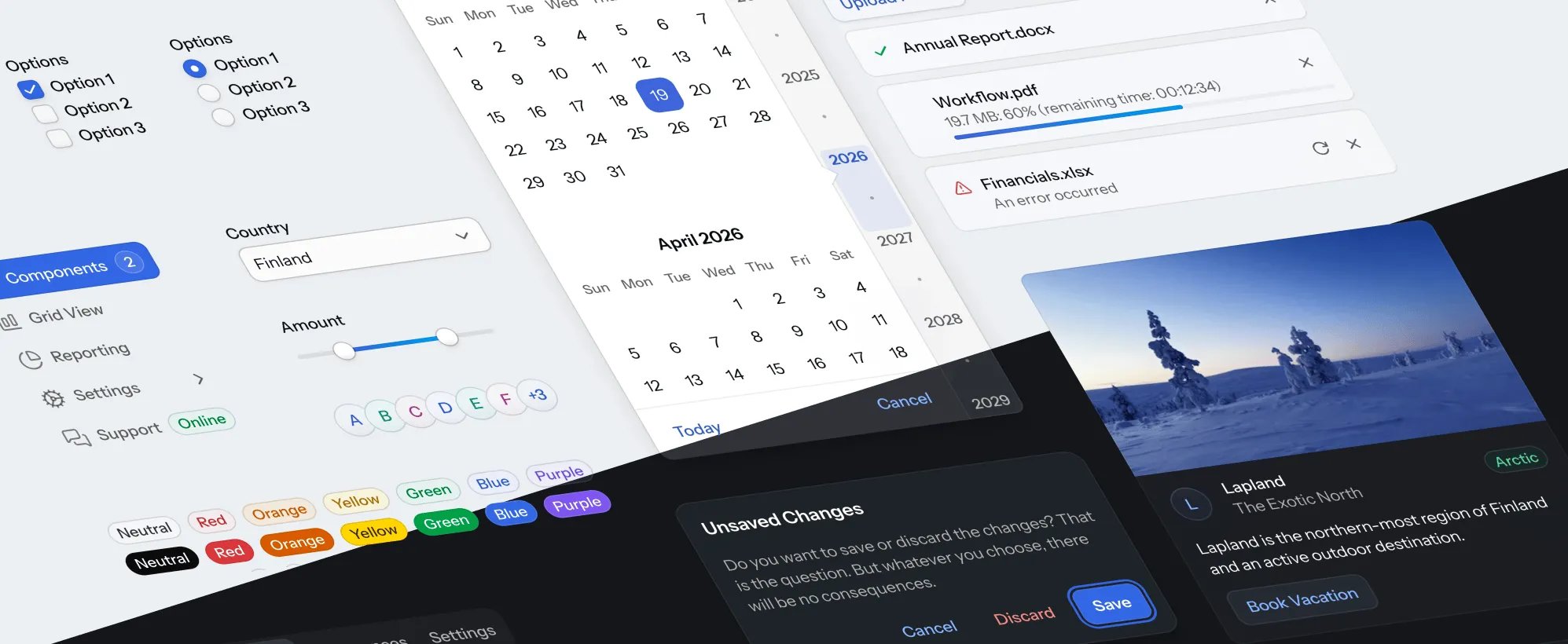
Before customizing Aura or components directly, see if the built-in component variants are enough for your needs. They cover common cases like sizing, emphasis, and states, allowing most applications to work with minimal customization. See the component styling pages for reference, for example, Button Style Variants and Grid Style Variants.
|
Source code
CSS
html {
  /* Color */
	--aura-background-color-light: #FFFFFF;
	--aura-background-color-dark: #171717;
  --aura-accent-color-light: var(--aura-green);
	--aura-accent-color-dark: var(--aura-green);
	--aura-contrast-level: 2;
  --aura-surface-level: -1;

  /* Typography */
  --aura-base-font-size: 15;
  --aura-font-family: var(--aura-font-family-system);

  /* Other */
  --aura-base-radius: 4;
  --aura-base-size: 20;
}
The html root-level selector is used in the example above to apply the changes globally to the entire UI. Most Aura properties can also be customized separately for individual layouts or other elements by using other selectors. The Styling HTML Elements and Styling Components pages provide more details on targeting different UI elements.
All Aura properties are listed on the Color, Typography and Other Properties pages.
Aura Theme Editor
The Aura theme editor allows you to visually explore the customization possibilities offered by the input properties. Use the Shuffle button to easily go through random combinations. If you see something you like, you can lock some options and continue exploring by shuffling the remaining unlocked options.
Once you’re satisfied with the end result, click the Export CSS button to get a CSS snippet that you can paste into your styles.css. (Note, that the “Use Navbar” options isn’t something that’s controlled by the theme – that’s part of the app’s layout/content).
This example shows the intended pattern: use computed Aura values to style your own container, while keeping the theme consistent across light and dark schemes.
Source code
CSS
.my-panel {
	background: var(--aura-surface-color);
	border: 1px solid var(--aura-accent-border-color);
	border-radius: var(--vaadin-radius-l);
	padding: var(--vaadin-padding-l);
}

.my-panel-title {
	color: var(--aura-accent-text-color);
	font-weight: var(--aura-font-weight-semibold);
}
Reference
For the full property reference and their corresponding safe override points, see the following sections.
- Color
- Colors, including surface and accent colors, and their corresponding style properties defined in the Aura theme.
- Typography
- Tables of Aura style properties related to displaying and formatting text.
- App Layout
- Style properties related to customizing the App Layout component specifically with the Aura theme.
- Other Properties
- Aura style properties related to sizing, spacing, corner shapes, shadows, and other visual styles.
tag::property-list-styles[]
end::property-list-styles[]