Themes & Base Styles
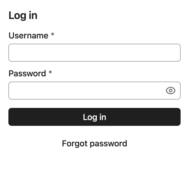
By default, Vaadin components are rendered with their minimal base styles. These can be a good starting point for creating a custom theme that should look significantly different than either of the two built-in themes.
Default Theme
When no AppShellConfigurator is defined in your application, the Aura theme CSS is automatically loaded as the default theme. In development mode, a log message suggests how to explicitly configure the theme.
To explicitly configure Aura, add the @StyleSheet annotation to your AppShellConfigurator:
Source code
Java
@StyleSheet(Aura.STYLESHEET)
public class Application implements AppShellConfigurator {
}
Explicit configuration is recommended for production applications so the theme choice is clearly documented in code.
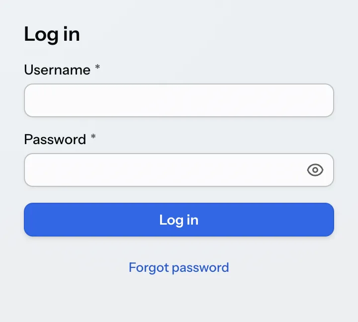
Aura Theme
Aura is the default theme for Vaadin applications, offering a modern and cohesive design for all official components. It works out of the box with built-in variants for common use cases, while also providing high-level CSS custom properties for easy customization. By computing colors, contrast, and surface hierarchy automatically, Aura lets you focus on your application while still achieving consistent, high-quality results.
To load the Aura theme in your application, add it with a @StyleSheet annotation on your main application class. The Aura class provides a constant for the path to the Aura stylesheet that can be used with the @StyleSheet annotation.
Source code
Java
@StyleSheet(Aura.STYLESHEET)
@StyleSheet("styles.css")
public class Application implements AppShellConfigurator {
 ...
}
Themes should always be loaded before any other styles in your application.
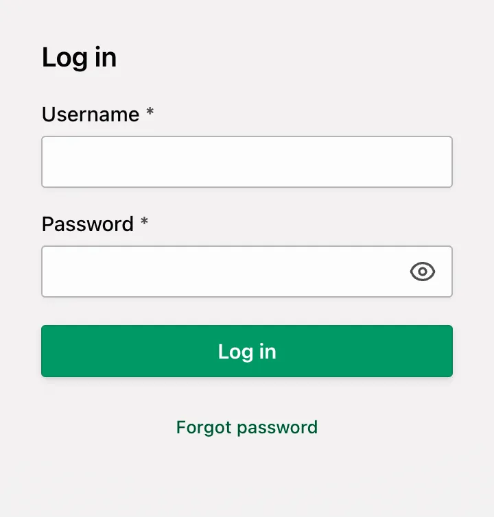
Aura includes a comprehensive set of style properties (custom CSS properties) that can be used to customize it without writing complicated CSS selectors.
Source code
CSS
html {
  --aura-accent-color-light: #009966;
  --aura-background-color-light: #f3f1f1;
  --aura-base-font-size: 15;
  --aura-base-radius: 0;
  --aura-base-size: 20;
  --aura-contrast-level: 2;
  --aura-font-family: var(--aura-font-family-system);
}
Lumo Theme
Lumo is a theme for Vaadin applications that offers a clean and consistent design for all official components. While Aura is the default theme, Lumo remains a dependable alternative with a strong focus on clarity, accessibility, and predictability. It provides a solid foundation for building applications or creating custom themes on top.

To load the Lumo theme in your application, add it with a @StyleSheet annotation on your main application class. The Lumo class provides a constant for the path to the Lumo stylesheet that can be used with the @StyleSheet annotation.
Source code
Java
@StyleSheet(Lumo.STYLESHEET)
@StyleSheet("styles.css")
public class Application implements AppShellConfigurator {
 ...
}
Themes should always be loaded before any other styles in your application.
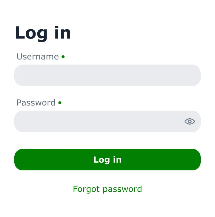
Lumo includes a comprehensive set of style properties (custom CSS properties) that can be used to customize it without writing complicated CSS selectors. See the Lumo style property reference for a complete list.
Source code
CSS
html {
  --lumo-primary-color: green;
  --lumo-primary-text-color: green;
  --lumo-font-family: Verdana;
  --lumo-font-size-m: 14px;
  --lumo-border-radius-m: 1em;
}
The Lumo Utility Classes, when enabled, can be used together with the Lumo theme.
Color Schemes
Both Aura and Lumo support a light and dark color scheme. By default, the light color scheme is used. You can configure a different color scheme for the application by adding the ColorScheme annotation to your main application class.
Source code
Java
@ColorScheme(ColorScheme.Value.DARK)
public class Application implements AppShellConfigurator {
    ...
}
The color scheme enum supports the following values:
-
ColorScheme.Value.LIGHT: Always use the light color scheme. -
ColorScheme.Value.DARK: Always use the dark color scheme. -
ColorScheme.Value.LIGHT_DARK: Use the light or dark color scheme based on the user’s OS or browser settings, with a preference for the light color scheme. -
ColorScheme.Value.DARK_LIGHT: Use the dark or light color scheme based on the user’s OS or browser settings, with a preference for the dark color scheme.
The color scheme can be changed dynamically at runtime using the Page.setColorScheme(ColorScheme.Value) method.
Source code
Java
UI.getCurrentOrThrow().getPage().setColorScheme(ColorScheme.Value.DARK);6a974a47-d137-4d97-847c-80be46f011df